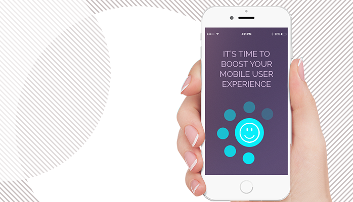
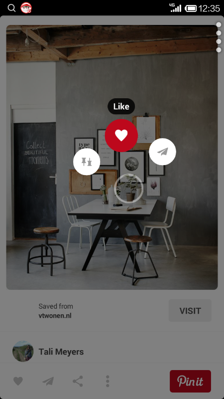
 Mobile applications are at the core of most internet strategies. Internet, SaaS and e-Commerce businesses depend on mobile apps to reach their business goals, whether they are constantly looking to increase retention rates, reduce customer acquisition costs (CAC) and increase monthly recurring revenue (MRR) and lifetime value (LTV). Standard and Innovative Three simple rules will let you stay on top of your app users and focus on optimizing your business goals. We believe an innovative user experience approach tightly combined with standard and common user flow would work best. Tip 1 – The Single Hand RulePut yourself in the place of your users. When are they using your application? Are they doing other things at the same time? Are they at home, school or walking in the street? Are their hands free? Are they holding and operating other objects? I can think about myself taking the train to work. In one hand holding the handle and with my other hand the smartphone trying to check at what time I will reach my destination or quickly cleaning my email inbox. There are many other examples involving a quick look and action: account balance, money transfer, like, share, accept and reject, find movie or TV series and watch. This is quite different than designing, developing and testing the application in your office while sitting at a desk. Now, envision your app on the smartphone while holding the device in one hand. Does it work? Are all major actions within finger reach? Can the user complete the actions that are important for you to achieve your business goals? Mobile Phone Interaction According to recent usability studies, most people are touching their screen only by using one hand: 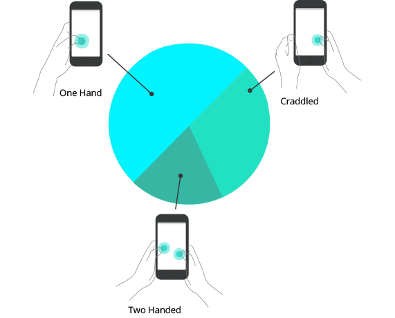 Pinterest got it right
Want to be cool, redesign your app Pie menu (or radial menu) provides users with a choice of three to eight options. Keep the menu as simple and clear as possible. It should offer relevant choices to the user at the point of decision and increase conversion rates. Draw an invisible circle at the center – center bottom of the screen: 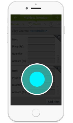 Put the main actions around it: 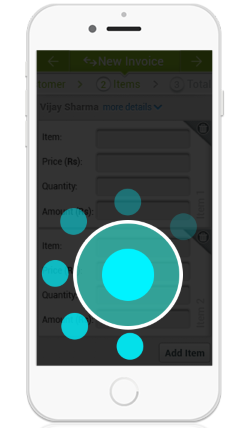 Fewer as possible options are better: 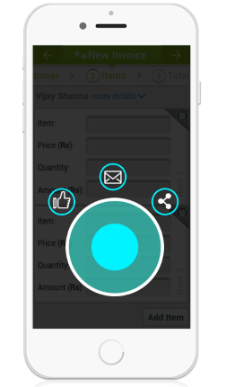 Position in the center of the circle the entity to take an action on: person, post, location: 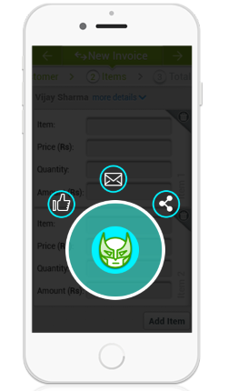 Now experiment and measure
You need to measure your application events, compare them to each previous design and then again and again until you’re satisfied. Are you getting more actions from your app? What is the most popular action? It is related to its location on the pie menu? Improve: add/remove items from this dialogue and/or change the location of buttons, change the flow: dialogue always on, appears on context, appears on touch. Notes First, your app may not require the single hand approach. It may be a business application used to enter customer information while meeting a customer. In this case your app is fine. Second, you may add another UI layer to your app. This will boost the experience of your app without changing the existing layout and functionality. Click here to continue reading...
1 Comment
Mike
2/28/2018 11:14:33 am
Thanks. Well said! Leave a Reply. |
Categories
All
AuthorGal Ofel is an experienced product innovation manager, marketer and entrepreneur. Recently, Gal founded and launched Zoostr, the mobile and desktop solution for entrepreneurs. Archives
August 2020
|

 RSS Feed